CyberCloud
A sans serif display font inspired by 2000’s digital design
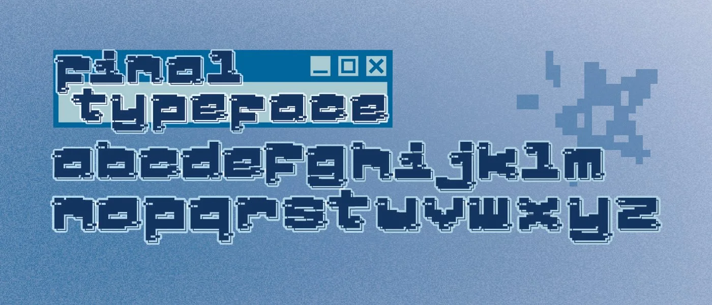
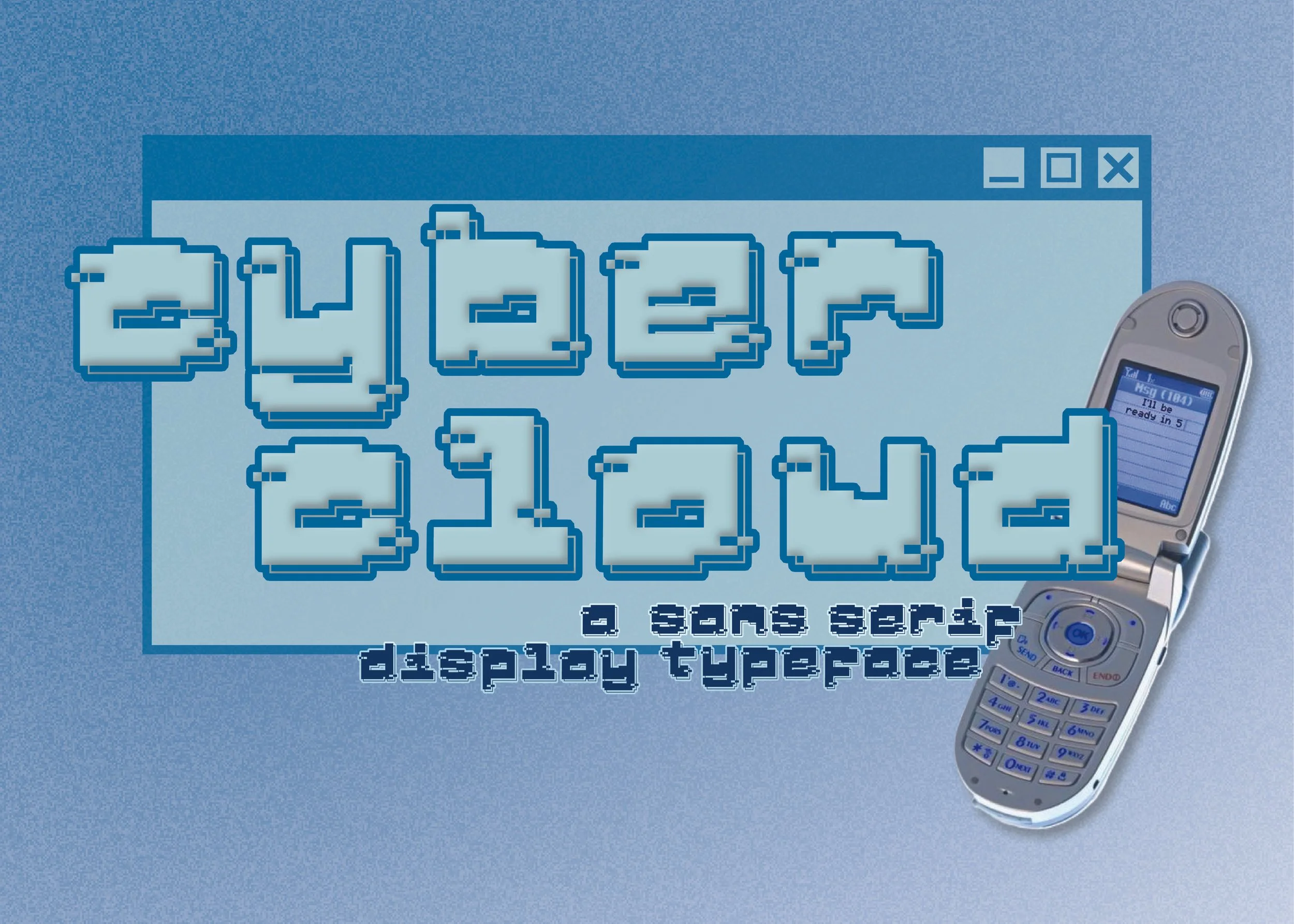
CyberCloud was created for a typeface design assignment at university. Inspired by 2000’s cybercore and video game advertisements, the aim was to create a monospaced display typeface inspired by elements of new and old. Through my job at a retro gaming store, I had a lot of exposure to old game box-art and menu design. Elements such as pixellated designs, glitch effects and geometric shapes were widely used during the era and were looked upon fondly by a lot of my customers. Around the same time, platforms like MySpace and Tumblr saw success through similar means of fresh, digital marketing. Through research into these prominent design elements, the design of CyberCloud was informed and drafted.
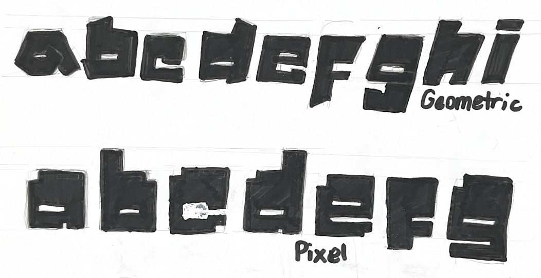
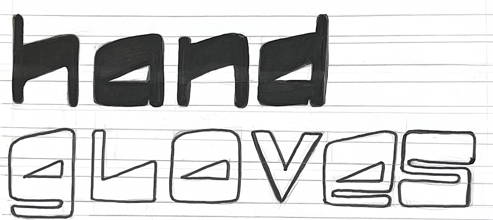
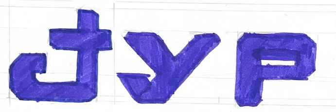
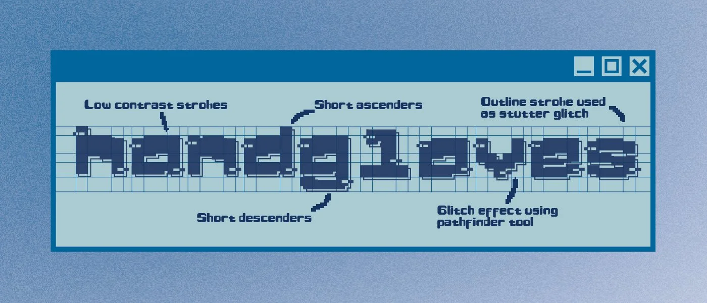
The creation of CyberCloud began with a variety of traditional sketches and experimentation. Letterforms were then traced over digitally, and the pixellated style was introduced. A glitch effect was created using the pathfinder tool in Illustrator and the backdrops of each letterform were made by duplicating the outline and placing it adjacent to appear like a shadow. The decision to have short ascenders and descenders was used to emphasise the main body of the letterform for a blocky feel. CyberCloud’s design was finalised with unicase lowercase letterforms with the intention to remain a standalone display font.